
Writing the cursive letter H can feel weird at first. It’s tall. It has loops. It doesn’t look like the regular printed H that we’re used to.
If you’re trying to write it better or teaching someone else, this guide will help you out.
I’ll walk you through:
- What the capital and lowercase cursive H look like
- Tips for writing both
- How to practice a little each day
By the time you’re done reading, you’ll feel way more sure about writing it. You won’t have to stop and think so much.
How to Write the Letter H in Cursive
Cursive writing helps you keep letters connected in one smooth line. It builds muscle memory, improves hand control, and can make writing faster.
Many kids learn cursive early to support brain development and fine motor skills. The letter H is a great one to practice because it uses both straight and curved strokes.
Uppercase Cursive H
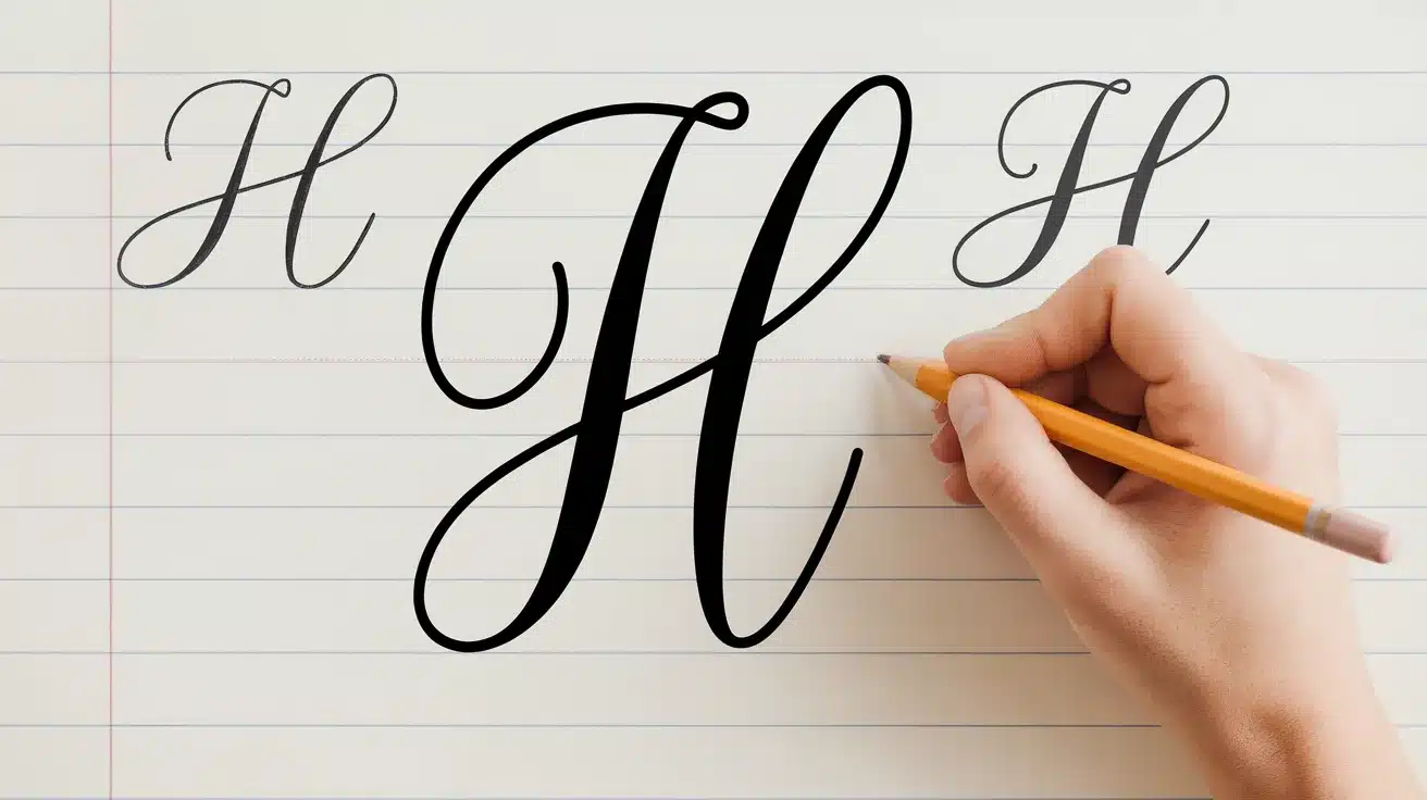
The capital H in cursive starts with a tall loop on the left, similar to a long l. Then it moves down, back up, and around into a second loop or curve.
This form doesn’t usually connect to the next letter. It’s large, balanced, and takes up the full height between the top and bottom lines.
Some styles feature a second stroke that curves inward, while others conclude with a loop that curves outward. Try a few versions to see which one feels most natural to write.
Lowercase Cursive h
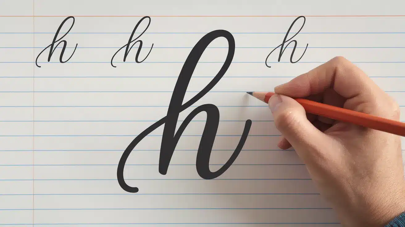
The lowercase h begins with an upward stroke to the top line. From there, it curves back down and forms a soft hump.
The end of the letter has a small tail that leads into the next letter. Some versions utilize a small loop, while others maintain a narrower and straighter shape.
Keep the height of the hump even with nearby letters, such as “n” or “m”, so your words appear smooth and tidy.
Cursive H in Different Styles
The letter H can appear in various forms depending on the cursive style used. Some are formal and flowing, while others are meant for everyday writing.
These styles alter the way the strokes connect and the level of detail applied to each curve.
Spencerian Style

Spencerian cursive has long, delicate loops and fine lines. The capital H in this style is tall with sweeping strokes that often extend past the top line.
It was used in the 1800s for business writing and remains a staple of formal calligraphy to this day. This style requires practice but yields a detailed and classic look once mastered.
Palmer Style

Palmer method is simpler and easier to write quickly. The cursive H in this style uses fewer loops and more straight strokes.
It’s often taught in schools and is designed for speed and control. This version is ideal for writing notes, letters, or any other task that requires clear and concise text.
Modern Script

Modern script adds personal flair to traditional cursive. The H might include bolder lines, extra curls, or slight changes in spacing.
Many modern fonts online use this style for logos, cards, or crafts. It gives you more freedom to play with the shape while still keeping the cursive flow.
Cursive H for Decoration and Design
The cursive letter H isn’t just for handwriting practice—it’s also popular in art, decor, and design projects. Its flowing shape makes it a favorite for monograms, crafts, and personal touches.
If you’re designing a gift, planning a tattoo, or adding flair to a journal, the letter H brings both style and meaning to creative work.
Monograms and Stickers
Cursive H is often used in monograms for weddings, home decor, and custom gifts. Its sweeping loops and curves give it a soft, personal look.
You’ll find it on vinyl stickers, embroidery patterns, and wall decals. Many shops offer ready-made designs or allow you to select your favorite font.
A single cursive H can be bold or simple, depending on how it’s drawn. Monogram stickers are also used on water bottles, laptops, and notebooks.
Tattoo Styles and Placement Ideas
The letter H is a popular pick for tattoos, especially as an initial. In cursive, it can look formal, soft, or artistic depending on the font.
Some people choose it as a name, a memory, or a meaningful word. It fits well on the wrist, collarbone, or behind the ear—places where a single letter makes a subtle mark.
Many cursive H tattoos use flourishes or extra loops to match the style of nearby ink. You can also combine it with symbols like hearts, vines, or stars for a more detailed design.
Scrapbook and DIY Craft Fonts
In scrapbooking and DIY projects, a cursive H can be printed, stenciled, or hand-drawn to add a touch of charm and elegance. It’s often used to start words, titles, or names with flair.
You can find script-style alphabet fonts online, perfect for tracing or cutting out. Crafters use cursive letters to label pages, decorate gift tags, or add initials to handmade cards.
The cursive H stands out in glitter vinyl, paint pens, or even wood cutouts. You can size it big or small depending on your project’s style.
Practice Sheets You Can Use
Practice sheets offer guided repetition, helping you train your hand for smooth, consistent strokes.
These sheets give you structure, spacing, and repetition—all important when learning a letter like H.
You can print them at home and use them daily to improve your strokes. They’re also great for both kids and adults looking to sharpen their cursive skills.
Beginner-Level Tracing Sheets

Beginner sheets focus on guided tracing. Each line shows a light version of the letter H that you trace over.
This helps your hand learn the shape and movement without relying on guesswork. Most beginner sheets use dotted or dashed lines, giving clear direction.
These pages often include arrows to guide stroke order. They’re great for slow practice and steady improvement.
Advanced Handwriting Lines

Once you’re comfortable with tracing, advanced sheets help you write the letter H independently. These sheets provide just a few starting points or letter samples for freehand practice.
The lines may also include slanted guides to keep your writing upright and smooth. These sheets challenge your control without visual aids.
They’re best for longer practice sessions and refining your rhythm.
Mixed Letter Practice Sheets

Mixed sheets combine the letter H with other letters, helping you practice flow and connection. You’ll find rows like “ha,” “hi,” or “th” to help you move between strokes.
This kind of practice gets you ready to write whole words in cursive. It also improves your spacing and control between different letter shapes.
These sheets build your confidence with both letter H and the rest of the alphabet.
Simple Fixes for Common Cursive H Errors
A few small habits can make a big difference when learning to write the cursive H. Here’s what to watch for—and how to get it right with steady practice.
- Uneven Loops: If your loops are too wide or too tight, the letter may look unbalanced or messy.
- Incorrect Entry Stroke: Starting from the wrong spot can break the flow and make the stroke look stiff.
- Inconsistent Height: Letters that are too tall or too short can throw off spacing and make writing more difficult to read.
- Use lined or dotted paper: It helps keep your strokes even and aids in maintaining size and spacing.
- Slow down when practicing: Writing slowly at first builds better control and steady motion.
- Warm up with basic strokes: Start each session with loops, humps, and up-down lines before writing letters.
- Check your grip and posture: Maintaining a relaxed hand and an upright posture makes writing smoother and less tiring.
Conclusion
The cursive letter “H” might seem tricky at first, but once you get how it flows, it starts to make sense. Now that you’ve got the main steps, I hope the tips and practice ideas make it easier for you.
Take your time. Go at a pace that feels right. Let your hand get used to the movement. You don’t have to rush. If you put in a little effort each day, you’ll see a big difference.
If you’re ready to keep going, I’ve got more to help you learn other letters. You’ll build up your confidence one stroke at a time.
Feel free to save this page or print the sheets. I’ll be here if you need more help.


